
Camp Norden
Naming // Branding // Collateral // Web // PHOTOGRAPHY // VIDEOGRAPHYChildren’s Cancer Research Fund (CCRF) had the opportunity to expand their family programs to include both an in-person and virtual camp experience for kids who have had or are currently experiencing cancer.
It was important that this new brand be approachable and meaningful for kids aged 8-17 while also still looking polished and professional to major donors and companies looking to fund an established program.
CREDITSMY ROLE: Associate creative director, lead designer, photographer
—
MINDY DYKES & SAM BINGEA: Co-camp directors
RYAN DURRY: Creative director
MAX OMSIN: Logo animator & junior designer
MEGAN MORREY: Writer
CESAR PEREZ VELIZ: Developer
AGLOW CINEMATICS: Videographer
—
Created at Children’s Cancer Research Fund
// Core ConsiderationSOften kids with cancer are the only child in their communities who has this experience and this is an identity that is hard to shake. In order for camp to be a place where they can feel free and empowered on their journey, the week is set up so that cancer needs are met allowing cancer to not be the main focus of their camp experience.
The name and brand follow suit by being deeply aware of the childhood cancer journey while focusing in on how we hope campers feel: connected, creative, and unstoppable.

// NameNorden is a German and Scandinavian word meaning north. Heading north represents journey, adventure, and connection. North is a set point to turn to when you are feeling lost. Finding your own true north is coming home to yourself.
With this name, the brand is rooted in the hope that each camper finds community and a way forward, even amidst the difficulties and after effects of cancer.

// Logos & MARKSBy sticking to monoline typography and shapes, the meaning of the name is established in a way that is approachable for all campers. It is easy enough to recreate with sidewalk chalk but not too childish for a 15 year old camper joining virtually.


// COLOR & TEXTURETo offset the simple line work of the logo and marks, textured photos of nature from camp along add interest while keeping an overall calming and welcoming vibe.
*To situate Camp Norden as a sub-brand of CCRF, the color green from their brand palette is used. Additionally a gold color reflects the color associated with Childhood Cancer Awareness.


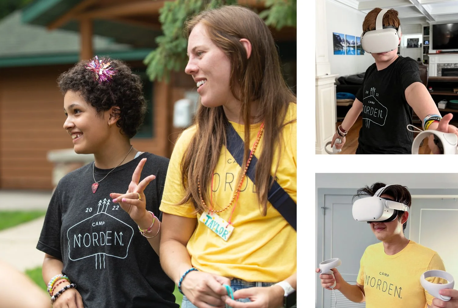
// PHOTOGRAPHYCamp Norden photography is light, playful, and genuine. Real moments are prioritized and photos aim to be as welcoming as possible, not clinical and cold.

A safe environment to have fun, feel good, and naturally connect.
~
A safe environment to have fun, feel good, and naturally connect. ~


// Impact & resultsData shows that Camp Norden has an overwhelmingly positive impact. While the programing, planning, and people working camp are strongly responsible for this outcome, the brand’s focus on connection, direction, and empowering campers is shown to be strongly linked to camper’s actual experience.
96% of in-person campers said Camp Norden helped them make new friends.
95% of parents said the in-person camp experience helped build their camper’s self-confidence and made them feel good about themselves.
100% said virtual Camp Norden is one of their favorite things they have ever done.
91% of virtual camp attendees agree or strongly agree that being able to use their creativity to build their own virtual reality helped them feel empowered.